Lessons in App Design from Making Caato Time Tracker+
We are a two man show and makers of Caato Time Tracker for Mac which is currently available on the Mac App Store. In summer 2014 we started working on our new product Caato Time Tracker+ that we develop for Mac, iPhone and Apple Watch. Since last year there are a few things I’ve learned and I want to share here.
Mockups
We started the development of Caato Time Tracker+ by making detailed mockups for both, the iPad and Mac version, and for each planned feature and screen of the app. Each day we would discuss and refine the mockups. Over and over again for both platforms and all screens. I think, in the end, we spent 3 weeks just doing mockups.
Building the app
Once we were happy with the mockups, we started developing the actual app. It turned out that a lot of the features we envisioned in the mockups didn’t really work and needed to be changed. In addition, we found that we wouldn’t be able to ship everything we had planned. So we made the decision to postpone developing an iPad version for the time being, as well as most of the more advanced features we had outlined in the mockups. However, we still wanted to integrate one of our most precious features: a timeline allowing the user to see when time was tracked during the day.

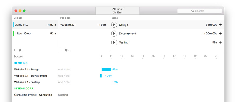
Caato Time Tracker+ with Timeline feature. Users had to create a client, a project and a task to start time tracking.
Showing the app to users
Once the timeline feature was mostly done, we shared the app with 5 people. As we got more and more feedback, we realized that the timeline feature was interesting and helpful, but that our app was lacking a basic overview to see on which days time was actually tracked. We realized that we had started with a more advanced feature without covering the basics. As a result, we removed the timeline feature for now and started working on a basic “reporting” overview for tracked time entries. After sharing the next version of the app with about 30 additional users, we gained another, even more important, insight: users found that it was too complicated to actually start tracking time. Well, that’s what a time tracker is all about, isn’t it?

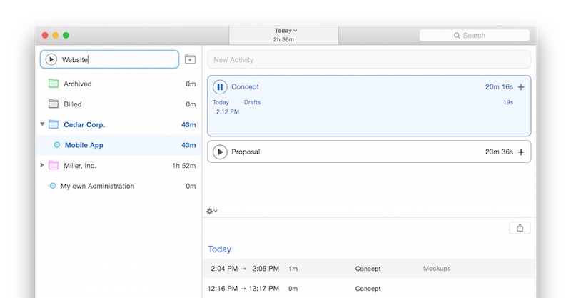
Current design of Caato Time Tracker+. Users can start tracking time by clicking on the Play button in the top left corner.
What I learned from all this
1) A few mockups suffice
The mockups we made helped us to shape our vision of the app and reminded us of how much work lay ahead. In the end, however, it would have been sufficient to make a few mockups for the most important features and for the Mac platform only. This would have been enough to discuss, refine, and start developing.
2) Involve more users earlier
I believe that we could have involved users before developing the timeline feature, possibly even earlier, and in higher numbers, too. Of course, the app was less interesting without the timeline, but, most likely, we would have gained some valuable insights at an earlier stage. By sharing the app earlier we would have been able to confirm early design decisions. This would have empowered us to build additional features on top of a solid product foundation.
3) Get the basics right first
It’s great to aim high and have a vision. However, it’s easy to get lost in feature creep. As good things take time, it seems important to get the basics right first before designing and implementing more advanced features.
4) Keep an open mind
Because of all the feedback we had already received for Caato Time Tracker, I was quite certain we knew how to make a new and better version, even before sharing the app with other users. Interestingly, most feedback we received until today is actually good. It would be easy to ignore the few rather negative feedback e-mails and pretend that it’s all fine and that those are just not the users we want. However, we decided not to. Instead, we asked ourselves if the current solution was the best we could offer. We realized it wasn’t, so we reworked the app once more. While it might still not be perfect, the app feels a lot better than before and we are eager to receive feedback on it.
5) Prototyping
Next time we are developing an app, it could be a good idea spending a few weeks just on prototyping to test design ideas before developing the actual app. Even though these prototypes aren’t real apps, it might also be worth a try to share them with others to see what resonates with them.
Leaning towards Lean
I think that Lean software development is tricky to apply to apps being developed for app stores as those are these shiny places where you usually only get one chance to get featured. However, this doesn’t really mean that we can’t apply Lean by releasing early and frequent beta versions of our app in order to amplify learning.
We are not there yet
The app is still in development for at least another 2 months. We are about to share the next version of Caato Time Tracker+ with around 60 people. I’m curious to see if there are more insights to come.